Overview
Two fundamentally different users. One platform that has to serve both.
BCT manages pension contributions for employers and individual retirement savers across Hong Kong — two user groups with entirely different mental models, tasks, and emotional relationships to the product. Employers need compliance-heavy, institutional-grade interfaces. Individual members need accessible, motivating experiences that feel personal.
The existing platform treated both identically. It failed both. As lead designer, I was responsible for redefining the product architecture, building a dual-identity design system in Figma from scratch, aligning four departments before a wireframe was drawn, and delivering sprint-by-sprint without slipping.
The core challenge: designing a scalable system that genuinely serves multiple distinct user types on one shared platform, where each user type feels fully catered for — not just accommodated.
01 — Cross-Functional Alignment
Four departments. Four definitions of "the user." One alignment workshop to fix that.
Before any design work, I ran a structured Discovery Workshop with stakeholders from Marketing, Business, IT, and Customer Service. Most had never articulated product priorities in the same room at the same time.

Cross-functional workshop — aligning four departments on shared priorities before a single wireframe was drawn
The workshop revealed structural misalignment: Customer Service designed for elderly users struggling with navigation; Marketing was building for a younger engagement audience; IT was focused on technical debt. Without resolution, any design would have been contested at every review.
The workshop output wasn't a slide deck — it was a shared user model and ranked priority list that all four departments co-signed. That document governed every design decision from that point forward.
02 — Platform Architecture
The product decision: one platform, two distinct experiences, one design system underneath.
Rather than building two separate products, I proposed a dual-identity architecture: a single platform delivering two distinct visual experiences, built on a shared component library. Same IA. Same components. Two brand expressions.
Platform audit — the existing product before redesign, showing structural and visual inconsistencies across user types
The dual-identity system
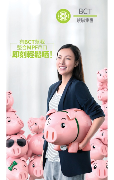
- Green identity (MPF / employer-facing) — compliance-heavy; signals institutional trust, stability, and regulatory authority
- Pink identity (Engagement / member-facing) — personal finance; signals accessibility, progress, and aspiration
- Shared Figma component library — buttons, forms, tables, navigation; one source of truth powering both identities; single engineering handoff, zero duplication
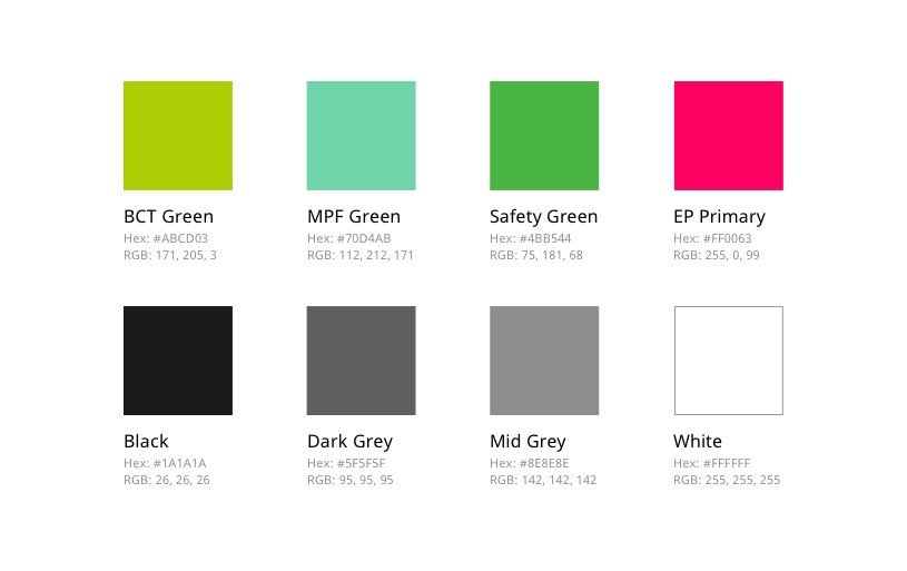
Dual-identity design system in Figma — Green and Pink identities built on a single shared component library
03 — Sprint Delivery & Design System Governance
Fortnightly sprints. Production-ready Figma specs. No missed handoffs.
Delivery ran as fortnightly design sprints — each producing production-ready Figma specs for a specific product module, followed immediately by an engineering handoff session. I owned the quality bar on every screen and ran all client-facing design reviews.
Alongside delivery, I mentored a junior designer — pair sessions, component library reviews, and building their ability to produce handoff-ready screens independently on routine modules by the end of the engagement.
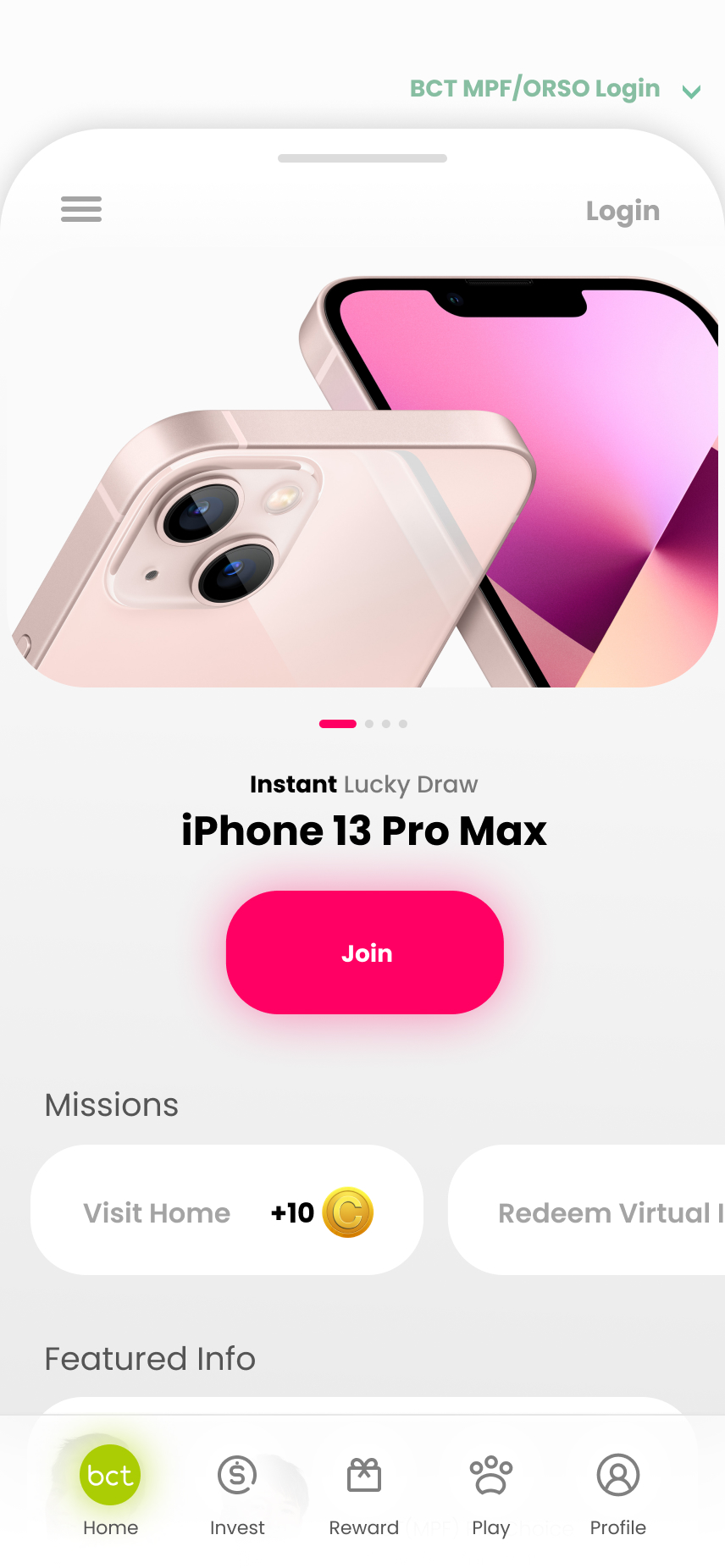
Redesigned platform homepage — dual-identity system applied at the most visible entry point
Impact
A scalable design system — not just a redesign.
Outcomes
- Dual-identity system in Figma — employer and member views from a single component base
- Full platform redesign delivered on schedule across all sprints
- Cross-functional alignment achieved before design began, eliminating late-stage stakeholder conflict
- Engineering handoff: single annotated Figma library, implementation-ready, zero duplicate components
- Junior designer capacity grown significantly throughout the engagement
"Building a platform for two distinct user types doesn't mean building two products — it means building one system flexible enough to speak two languages. The design system is what makes that possible without creating drift."
Key design principle from the project