Overview
A consumer engagement product built to scale — not just a revamp.
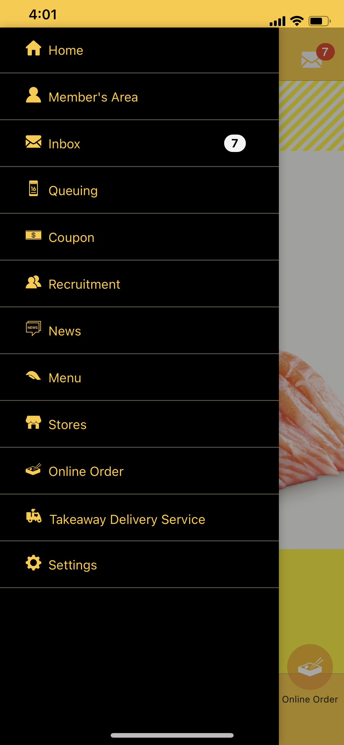
Genki Sushi had rebranded: new mascot, new store energy, new expansion strategy. But the app was still running on old visual logic and an information architecture that had no room to grow. The business needed four new engagement features — food ordering, virtual queuing, a loyalty member area, and a store locator — but the existing IA couldn't absorb them without becoming worse.
As sole designer through Deloitte Digital, I was accountable for the full product surface — from the first discovery workshop through to the final engineering handoff. Every product decision, every trade-off, every sprint — solo.
01 — Discovery & Feature Prioritisation
Business requirements first. Then user research. Then design — in that order.
I opened with a Discovery Workshop bringing together Genki's marketing team and IT team — two groups that rarely sat together to talk product. The goal: surface constraints before solutions. What the business actually needed, what engineering could realistically build, and where those two things conflicted.
Discovery workshop — aligning business goals, technical constraints, and feature priorities before any wireframe was drawn
Four features. Each with a business rationale.
- Scan & Order Food — captures in-store digital ordering; reduces front-of-house labour, increases order accuracy
- Virtual Queuing — distributes peak-hour load; gives the business real footfall data; users join before leaving home
- Member's Area — loyalty members are highest-LTV customers; points and coupons visible in one tap, not buried in a menu
- Store Locator — supports multi-location expansion; filter by queue wait time to smooth demand
02 — User Research
Go to the store. Then talk to the users.
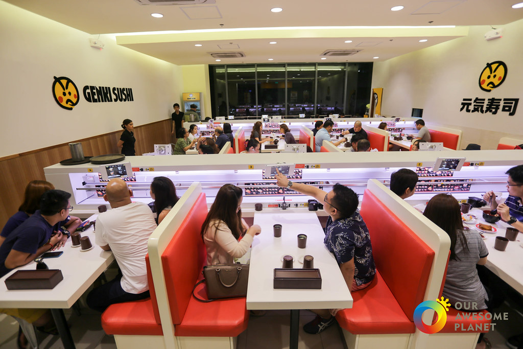
Before interviews, I visited a Genki Sushi store with fresh eyes — observing the new branding, the conveyor-train ordering system, and the split between tablet and smartphone ordering across locations. Two different in-store experiences on the same app. That tension had direct product implications.
User interviews — uncovering actual behaviour vs. stated preferences across three distinct user types
Three user personas emerged: the Loyalist (a long-term member who visits twice a week and plans around coupons), the Regular (a younger non-member who orders digitally as a habit), and the Planner (a family organiser who manages the full dining logistics in advance). Each had distinct needs from the same product.
03 — Product Research
Audit the existing product before proposing anything new.
User interviews tell you what people say. A product audit tells you what the product actually does. Before committing to any design direction, I ran a structured three-phase review of the original Genki Sushi app — not to document problems, but to build a shared evidence base that the client, engineering, and I could all reason from.
Three-phase audit methodology
- Phase 1 — Unguided walkthrough: Explored the full app without any task in mind — assessing overall navigation logic, visual hierarchy, accessibility, and first-impression clarity. This surfaces structural issues that task-focused reviews miss.
- Phase 2 — Task simulation: Completed each core user journey (order food, join queue, access loyalty, find store) as a first-time user. Identified where friction emerged, where the system gave no feedback, and where users would abandon.
- Phase 3 — Client painpoint validation: Cross-referenced every client-reported issue against what I observed — confirming which complaints were symptoms of deeper structural problems, and which required targeted UI fixes only.
Original app audit — 5 screens reviewed. Click image to enlarge, arrows to navigate.
The audit confirmed all three client painpoints — but reframed them. The visual mismatch with new branding was a symptom of having no design system. The buried CTAs were a symptom of an IA built for four menu items trying to hold twelve. The lack of room for new features wasn't a content problem — it was an architecture problem. Every design decision in the project flowed from that diagnosis.
04 — IA & Product Architecture
Architecture before screens. Screens before system. System before handoff.
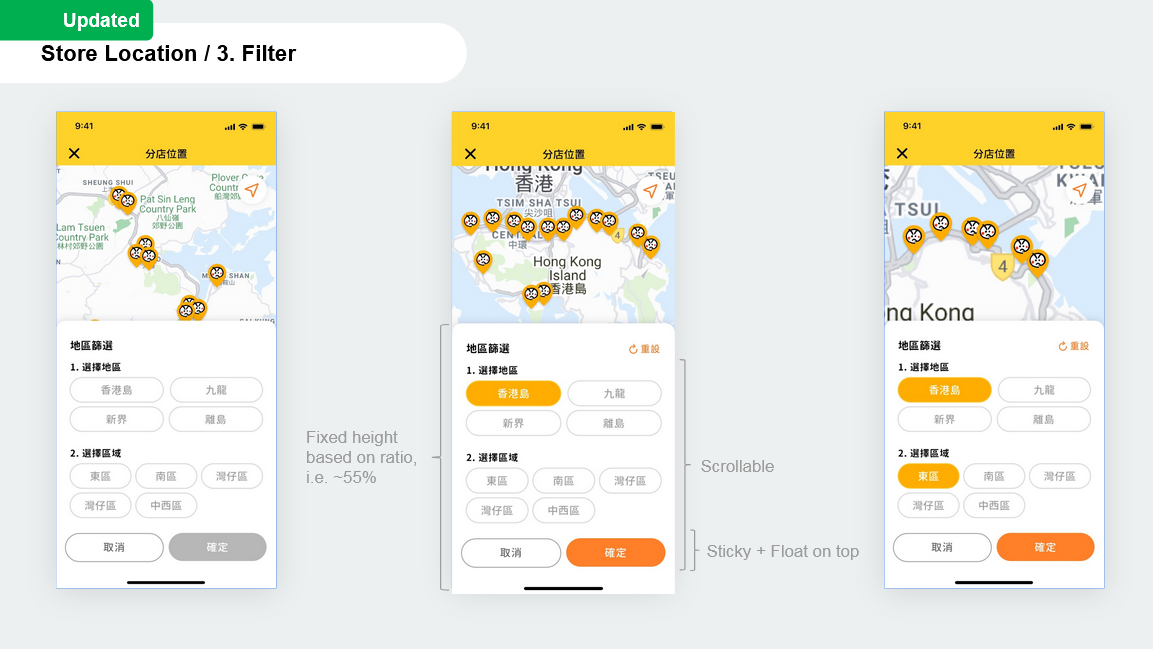
I front-loaded every structural decision: sitemap before wireframes, wireframes before UI, design system alignment before a single final screen. The sitemap defined how four new features could be absorbed into a rebuilt IA — with an Accessibility Matrix mapping each content element against both user value and business goal.
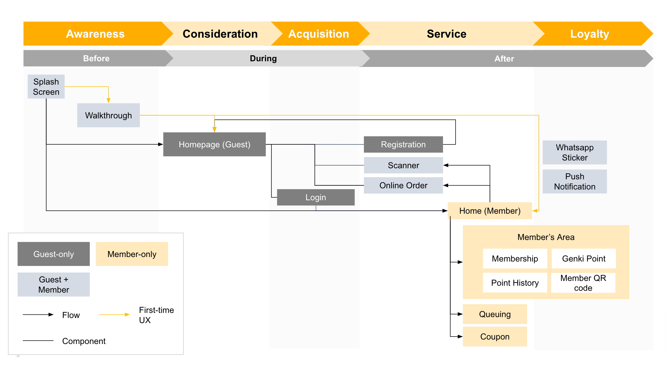
Sitemap v1 — initial IA draft with Accessibility Matrix. Product architecture made visible before design begins.
Sitemap v2 — Revised Architecture
After stakeholder review, the IA was iterated to reflect refined feature groupings, clearer navigation hierarchy, and edge-case user flows surfaced during wireframing.
Sitemap v2 — live Figma file. Scroll or zoom inside the embed to explore.
Wireflow iterations — navigation structure (left), queue and loyalty engagement flows (right)
05 — Design System
One design system session. No rework on 50 screens.
Before any final UI, I ran a dedicated design system alignment session with the client: colour tokens, type scale, major components, and homepage style all approved together in one session. That eliminated the most expensive late-stage failure mode in consumer product design — structural visual feedback arriving after 50 screens are already done.
Every component — buttons, forms, cards, navigation patterns — was built once and referenced everywhere. The web platform was built from the same library. Zero duplication. Zero drift between app and web at engineering handoff.
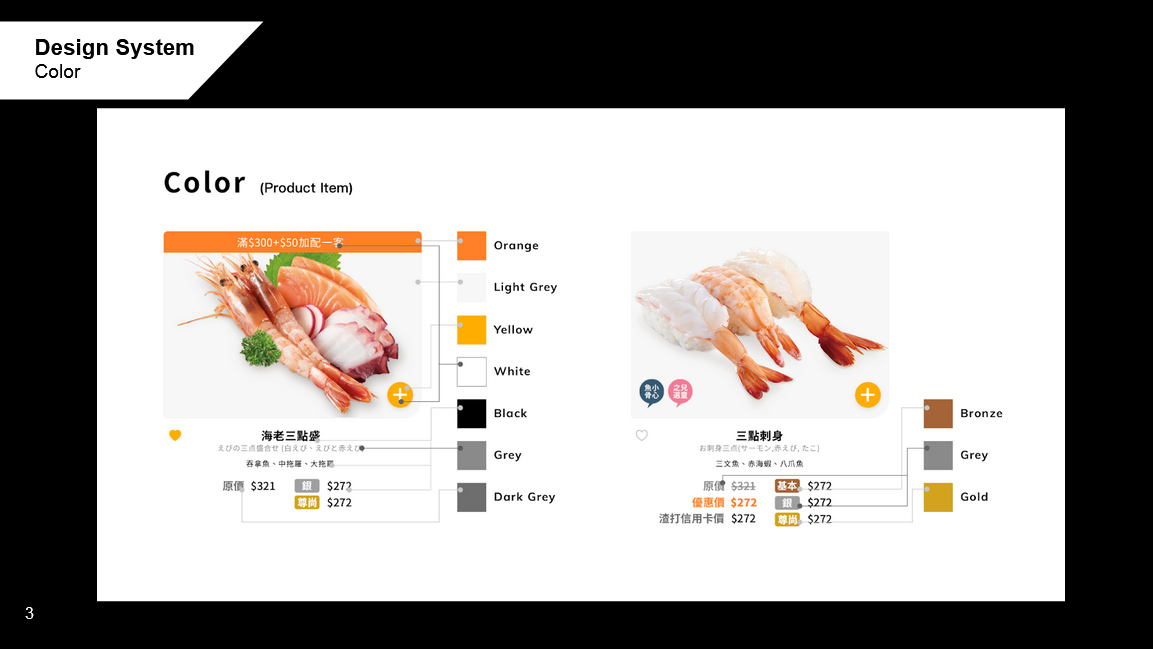
Shared design system — colour tokens, type scale, key components. App and web both built from the same source.
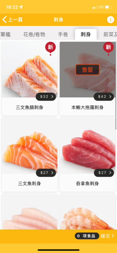
06 — App UI
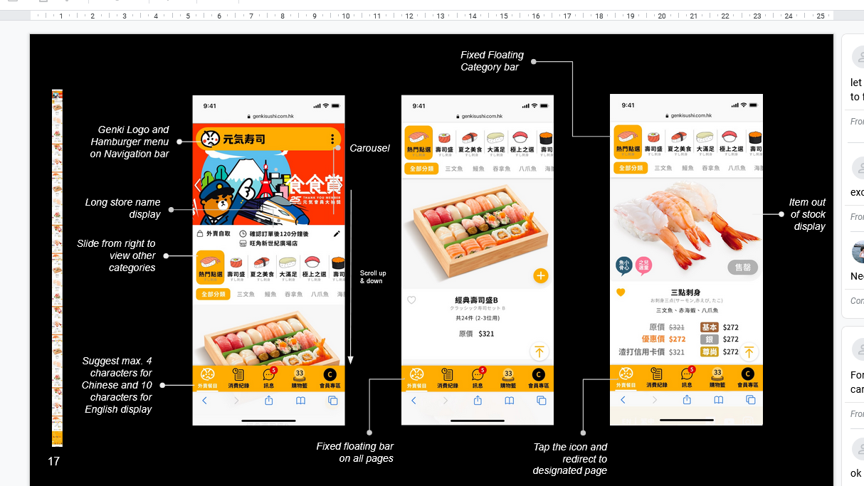
Four features. Every screen designed sprint by sprint.
The visual identity brief: new mascot, high energy, Japanese-inspired — aligned to the new store experience. The product design brief: fast navigation, one-tap access to everything that matters, and a loyalty experience that feels earned rather than buried.
The first screen is a product decision.
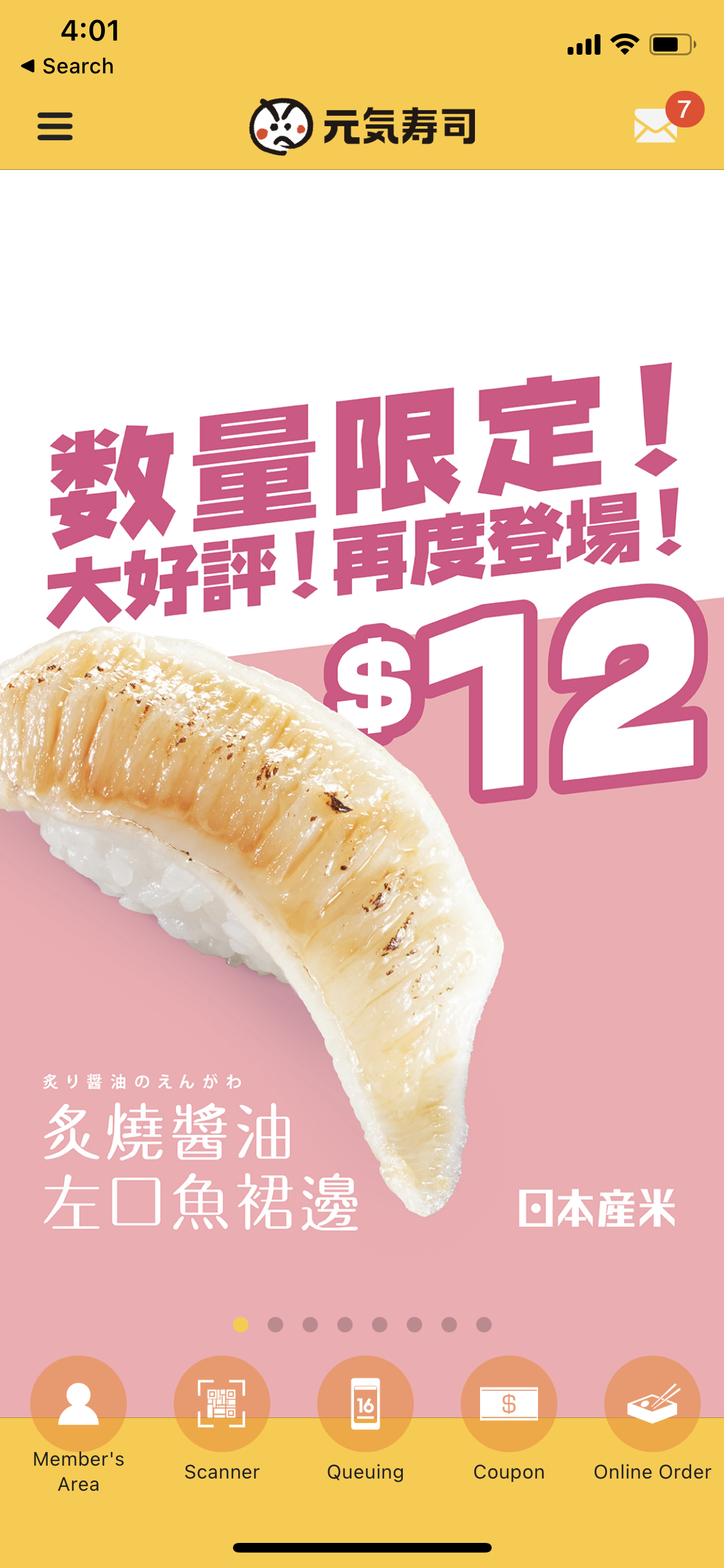
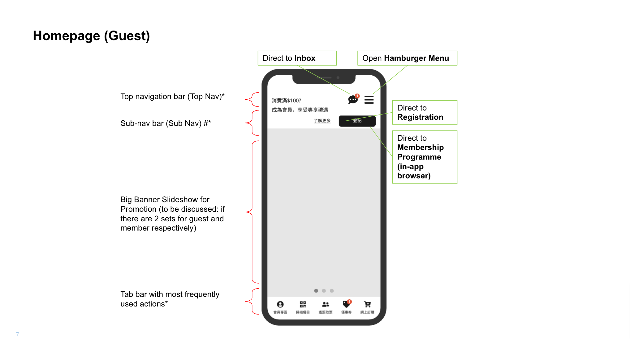
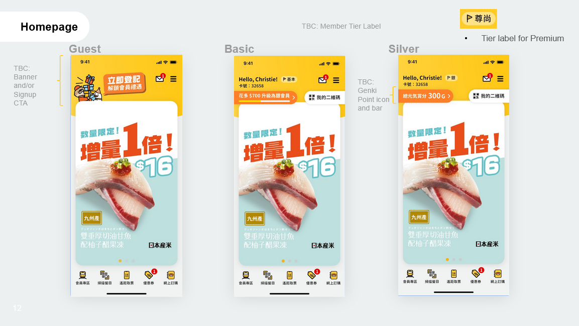
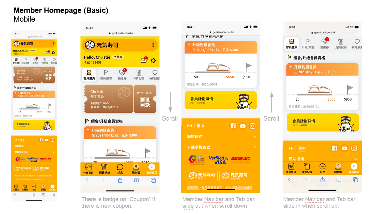
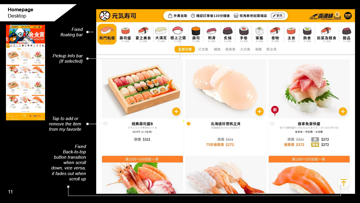
The homepage redesign wasn't aesthetic — it was a hierarchy decision. What does a loyalty member see first? What drives the most frequent action? The new home surface surfaced member status, current queue state, and the primary CTA in one viewport. No hunting. No extra taps.
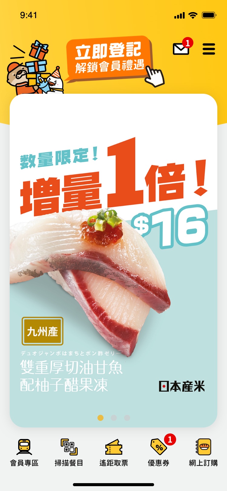
Homepage UI. Click to enlarge.
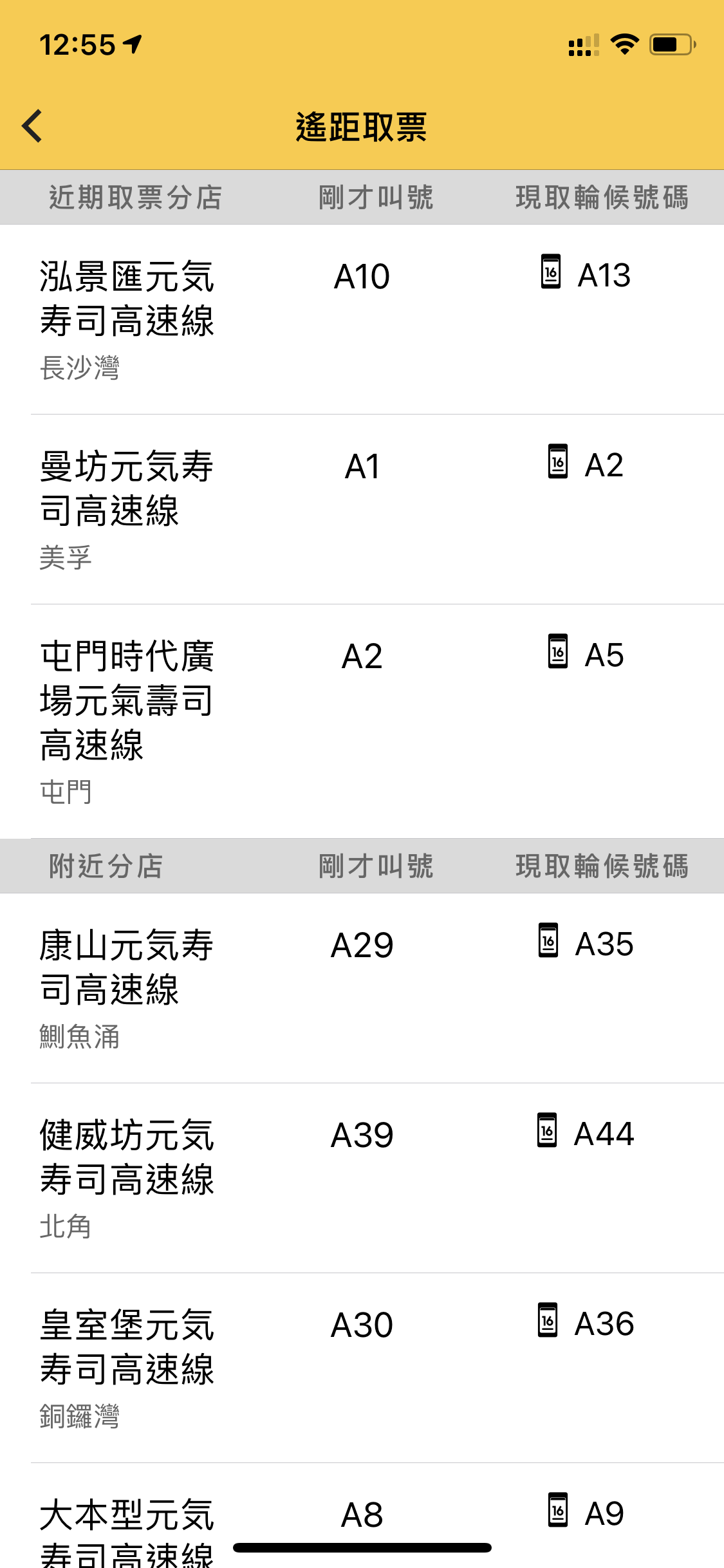
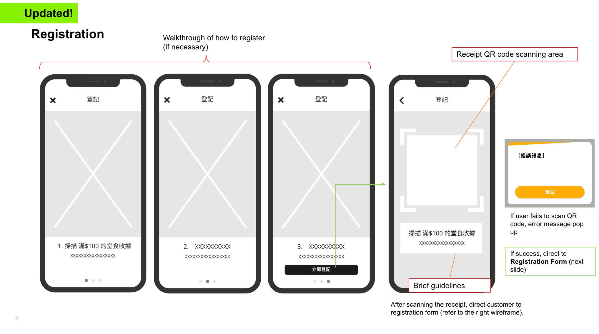
Queue before you leave home.
Virtual queuing was a 0-to-1 feature — no legacy flow to build on. The design challenge: queuing has high stakes, multiple states (joining, waiting, arriving, seated), and needs to work purely from a phone screen. I designed the full state machine before drawing a single screen.
Virtual queuing UI. Click to enlarge.
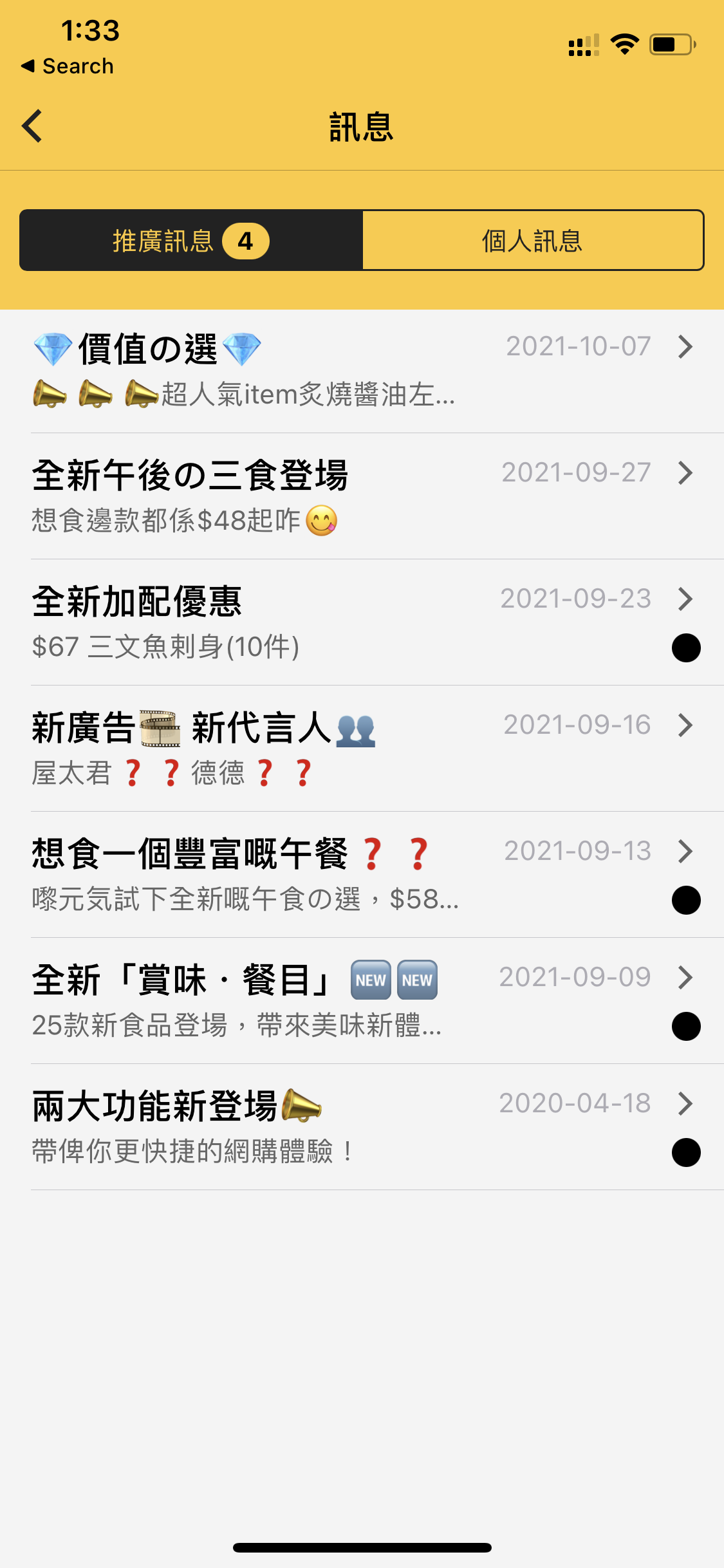
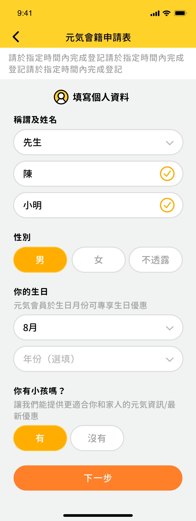
Loyalty that behaves like a product, not a perk.
The Member's Area was the highest-value feature for the business — LTV of loyalty members is measurably higher, but only if the experience gives them a reason to engage between visits. Points, coupons, and tier status were redesigned to be immediately readable, actionable, and motivating. Not just visible — worth opening the app for.
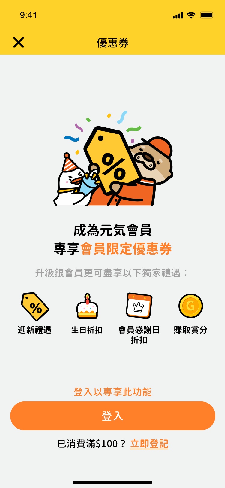
Member's Area UI. Click to enlarge.
Feature 04 — Full Sprint Delivery
Annotated screens. Product decision log at every handoff.
Final screens were delivered sprint by sprint, each with annotated UX rationale — what changed from wireframe, why, and what constraint drove the decision.
Sprint UI delivery — annotated screens with product decisions and UX rationale. Click to enlarge.
Final app UI — home & loyalty (left), food order & secondary flows (right). Click to enlarge.
Companion — Web Revamp
One brief, one system, two platforms.
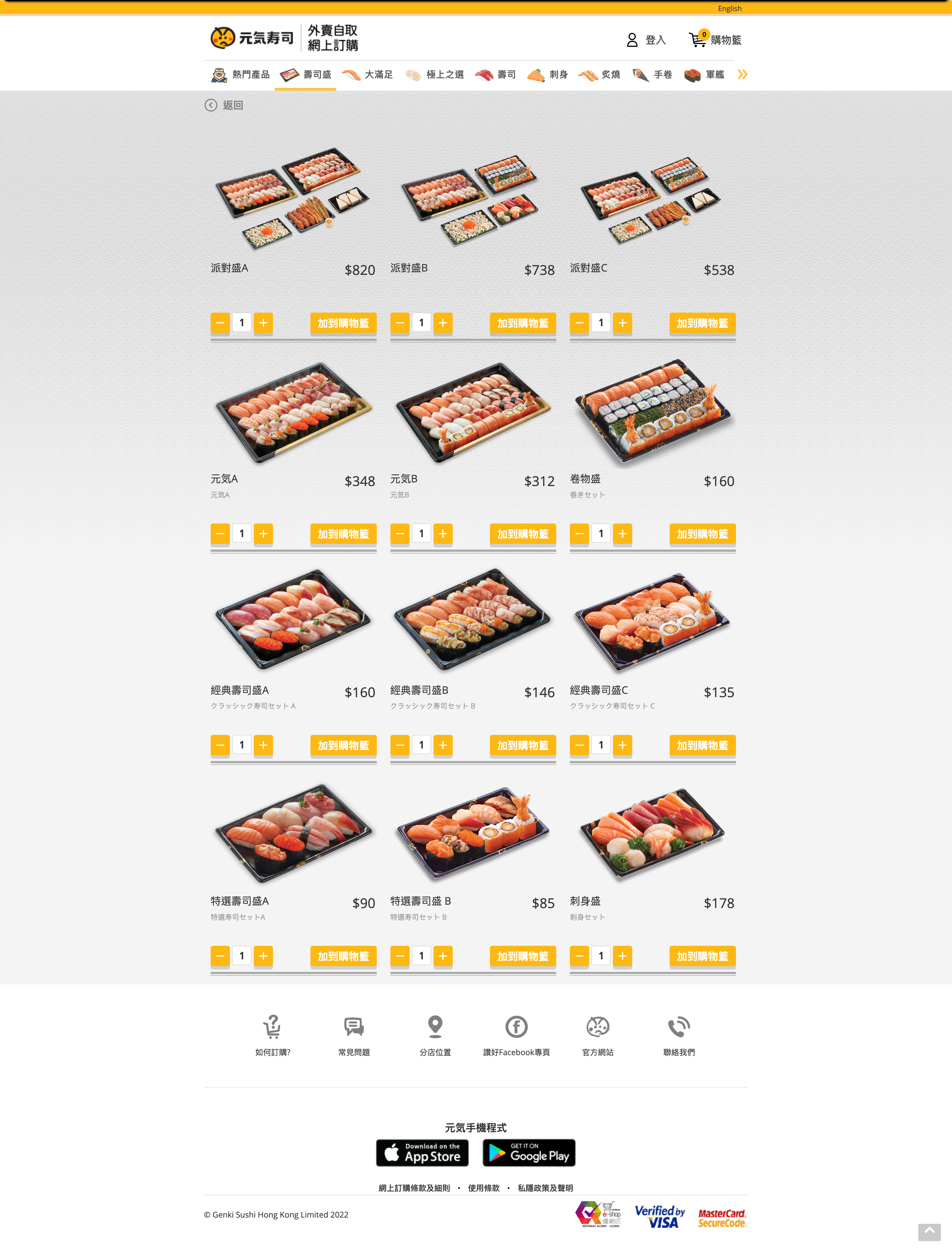
In parallel, Genki's company site and food menu site — previously two separate URLs — were consolidated into a single web presence. The website's job was distinct from the app's: brand and acquisition for new customers, e-commerce food ordering, and a Member's Area with full parity to the app. Same design system. Same tokens. Same components. One handoff.
Web UI — brand homepage (left), food order flow (centre), Member's Area (right). Click to enlarge.
Before & After
Same product. Different decisions.
The "revamp" brief was a prompt. The actual work was a product architecture decision — rethink the IA, ship four new features, and build a system that doesn't require another full rebuild when the next feature lands.
 Before
After
Before
After
What broke
- UI built on old branding — contradicted every new store
- Hamburger menu overloaded — key CTAs unreachable in one tap
- No virtual queuing, no food ordering, no extensible IA
- Loyalty points buried — three taps from home
What changed
- New visual system built on mascot and brand energy
- IA rebuilt from scratch — every key CTA in one tap
- Four features shipped: order, queue, loyalty, store locator
- Member's Area surfaced on home — drives between-visit engagement
Impact
Four features shipped. One system. Zero component debt.
Outcomes
- IA rebuilt from scratch — navigation hierarchy redesigned around user tasks, not legacy category structure
- Four engagement features shipped — ordering, queuing, loyalty, store locator — all integrated into one coherent product
- Shared design system across app and web — single source of truth, zero duplicate components at handoff
- Engineering handoff via Zeplin — production-ready, annotated, implementation-ready from day one
- Three wireflow iterations completed in two weeks — rapid stakeholder alignment, zero rework
"Consumer engagement products fail when new features are bolted onto old architecture. The only durable solution is to rebuild the IA first — then add features into a structure designed to hold them."
Key design principle from the project